Thursday, March 3, 2016
Experimental Drawing: Examples and Inspirations
Here are a few images from artist Larry Rivers to inspire you with your current assemblage drawing.


Int. Painting: Mediated Landscape Examples
Here are a few of the images I showed in class that relate to possible strategies for the mediated spaces project.

Paul Noble and "Nobstown" - use of isometric perspective

David Schnell - use of linear perspective and abstraction

Mickalene Thomas - use of collaged photo elements as a reference

Mary Iverson, use of linear perspective to add elements into a landscape

Will Cotton - Construction of still life that acts as landscape

Neo Rauch - use of expanded spaces that work non-linearly

Paul Noble and "Nobstown" - use of isometric perspective

David Schnell - use of linear perspective and abstraction

Mickalene Thomas - use of collaged photo elements as a reference

Mary Iverson, use of linear perspective to add elements into a landscape

Will Cotton - Construction of still life that acts as landscape

Neo Rauch - use of expanded spaces that work non-linearly
Sam Noble Museum Week and Reading
A reminder we will be meeting at the Sam Noble Museum on Campus both Tuesday and Thursday of next week. The Museum does not open until 10 am, so we will meet there at 10 am and get to work.
Please bring either your sketchbook or drawing pad and some drawing materials. I'd bring the following:

Reena Saini Kallat, “Hyphenated Lives (Ti-khor)” (2015), gouache, charcoal, ink, and electric wire on handmade paper (all images courtesy the artist and Nature Morte, New Delhi) (
Please bring either your sketchbook or drawing pad and some drawing materials. I'd bring the following:
- Pencils - at least a few, HB, 2B, 2H
- Eraser
- Vine Charcoal and Compressed Charcoal
- Paper Towels (just fold up a few and bring them with you in your pocket or drawing box
I will go over instructions at that time, but you will be collecting sketches and drawings for use in a "hybrid" drawing we will work on after break.
To give us something to think about regarding the objects and images we are looking at and potential affective meanings, I'd like you to read the following article from Hyperallergic.

Reena Saini Kallat, “Hyphenated Lives (Ti-khor)” (2015), gouache, charcoal, ink, and electric wire on handmade paper (all images courtesy the artist and Nature Morte, New Delhi) (
The article discusses images stitched together and combined, similar to the project we will be working on post-spring break.
Have a read through over the weekend and plan on being able to discuss briefly on Tuesday.
Thursday, February 25, 2016
Momentum OKC Volunteer info
Hey everyone, I mentioned in class on Tuesday the opportunity to gain some professional experience, make some good contacts and help out a great organization that does a lot to support the arts in this state. Here is the link to the Momentum OKC 2016 volunteer signup page. There are lots of times available and lots of different areas to help with from painting walls to hanging art. Check out the link below:
http://www.signupgenius.com/go/8050549a8aa2ea31-momentum
http://www.signupgenius.com/go/8050549a8aa2ea31-momentum
Thursday, February 18, 2016
Beginning Drawing - Contour Project Examples
Here are few examples of student work from previous semesters of this current project.
Use these as inspiration, but please use the assignment guidelines creatively to create your own composition and method for applying these marks.

Elise Gordon, Beginning Drawing - Spring 2015

Sarah Million - Beginning Drawing - Spring 2015

Tuoc Nguyen - Beginning Drawing - Spring 2015
Use these as inspiration, but please use the assignment guidelines creatively to create your own composition and method for applying these marks.

Elise Gordon, Beginning Drawing - Spring 2015

Sarah Million - Beginning Drawing - Spring 2015

Tuoc Nguyen - Beginning Drawing - Spring 2015
Tuesday, February 16, 2016
Experimental Drawing: Palimpsest Inspiration
Just dropping some images of these Jenny Saville Drawings here for you to look over. Great energy and vitality to the mark making. There is an interesting hierarchy to the drawn marks where they can be read together as a whole image but also others coalesce and tighten up into more detailed passages.


Intermediate Painting - Color Layer!
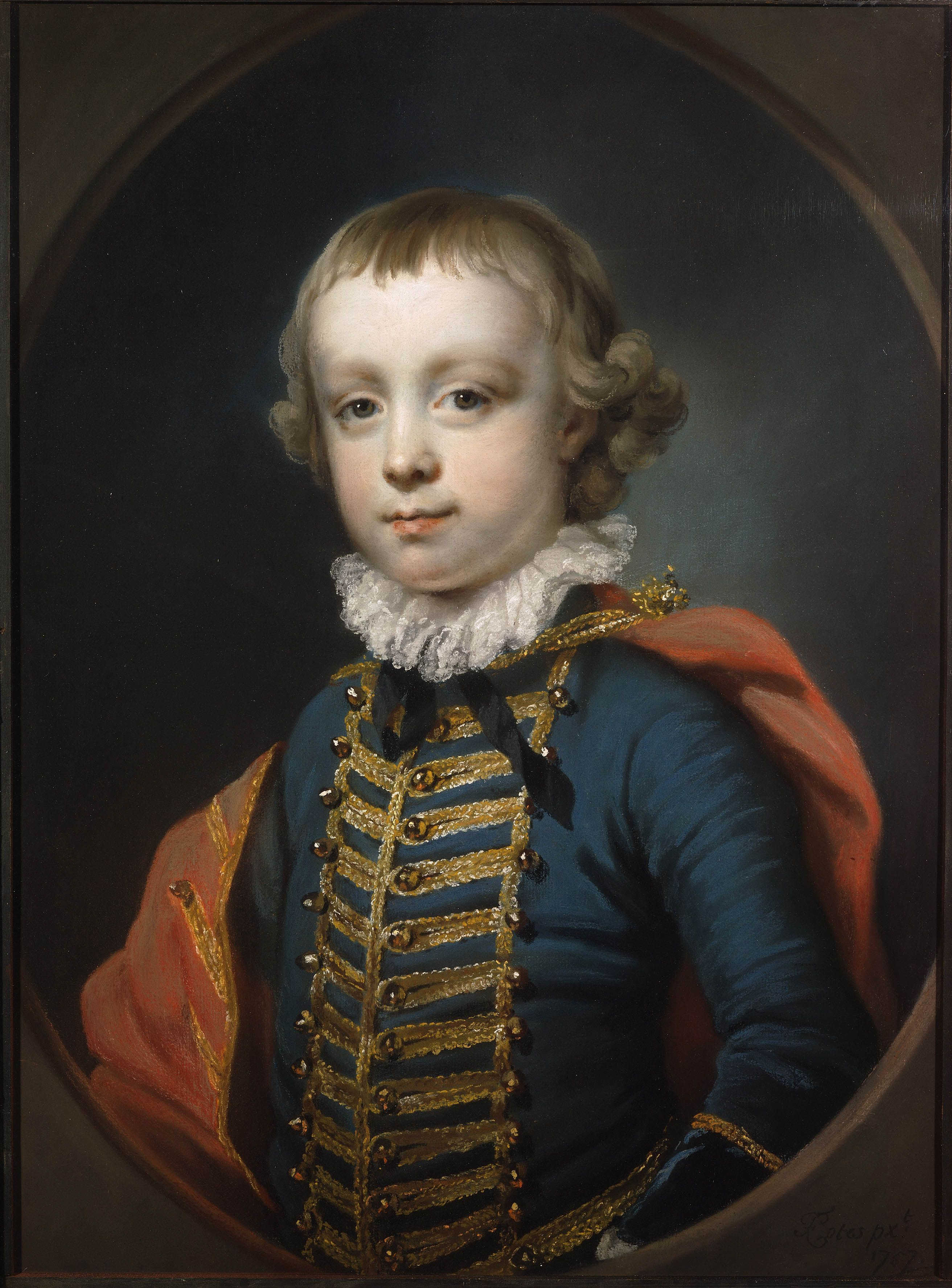
Today we take the plunge and start adding color to our completed Grisaille Portraits. This works best if you begin by using a "half-paste" (meaning a semi-transparent) layer of color allowing some of the nice grey to peek through. You can see this in the image below of Francis Cotes' portrait of Frances Vernon. Lots of grey in the darker mid-tones and shadows.

Thinner application of color in shadows and dark mid-tones. You can and will add more opaque passages in the lightest areas. And Below another detail from a painting Ingres.

We will add more Opaque passages and transitions in subsequent layers - for now get some thin layers of color developing. Think about color temperature - warmer colors in mid-tones and highlights (warm pinks, oranges, etc.) and cooler in shadows (blues, greens, etc.).

Thinner application of color in shadows and dark mid-tones. You can and will add more opaque passages in the lightest areas. And Below another detail from a painting Ingres.

We will add more Opaque passages and transitions in subsequent layers - for now get some thin layers of color developing. Think about color temperature - warmer colors in mid-tones and highlights (warm pinks, oranges, etc.) and cooler in shadows (blues, greens, etc.).
Thursday, February 11, 2016
Intermediate Painting - Grisaille Inspirations
Here are a few examples of Grisaille for inspiration...
Jamie Adams - Contemporary Figurative painter, much of his body of work is paintings completed in a very refined Grisaille method.


Also a famous oldie but a goodie, Ingres' Odalisque in Grisaille...

Jamie Adams - Contemporary Figurative painter, much of his body of work is paintings completed in a very refined Grisaille method.

Also a famous oldie but a goodie, Ingres' Odalisque in Grisaille...

Thursday, February 4, 2016
Intermediate Painting - Portrait: Underpainting Day 1
Today we are focusing on creating an underpainting for our portrait project utilizing a mix of burnt umber and burnt sienna. Below are some examples of the wipeout method demonstrated in class.


Beginning Drawing - Cross Contour Examples
We are continuing today to draw on the still life we did in class Tuesday. Finish refining the outer contour of your objects and begin to add cross-contour marks to help visualize volume and form.
Remember that cross-contours lines run parallel to each other across the surface of an object. See below for some examples of cross-contour marks.
Your homework for the weekend is to draw three objects in your sketchbook using cross-contour. Pick three varied objects, perhaps one that is round, (fruit?) another that is more geometric (TV remote, cell phone, etc) and another that is organic (hands, branch of a tree, etc).


Think of the wire-mesh 3-D models you have seen from behind the scenes of animated films like Ratatouille below.


Remember that cross-contours lines run parallel to each other across the surface of an object. See below for some examples of cross-contour marks.
Your homework for the weekend is to draw three objects in your sketchbook using cross-contour. Pick three varied objects, perhaps one that is round, (fruit?) another that is more geometric (TV remote, cell phone, etc) and another that is organic (hands, branch of a tree, etc).

Think of the wire-mesh 3-D models you have seen from behind the scenes of animated films like Ratatouille below.

Tuesday, February 2, 2016
Int. Painting: Photo Reference Tips
Since you will be relying on a photo reference for your upcoming portrait project you will begin on Thursday, choosing a good photo source will make your life a good easier.
The following photos come from a webpage I found with some tips, but for sake of ease I am posting the pictures here for reference. You can see the link here:
Over-exposed photo vs. under-exposed photo


Neither of these will be optimal. You lose information in the over-exposed photo in the light areas and are required to make up that anatomy, requiring a little more effort and knowledge.
The under-exposed photo loses all information in the dark passages leaving you the same problem.


In the above photographs you can see that the flat lit photo on the left does not provide a lot of shadows or form for you to work with. The center photograph shows a good range of values from darks to lights with plenty of midtones to help us understand the form.
Also, do not choose a tiny photograph, one that is over pixelated!
Also, if you are planning on appropriating images found online, consider some alternatives to just a simple google image search which often yields low quality images.
1) Flickr: www.flickr.com
2) Morgue File: http://www.morguefile.com/
The following photos come from a webpage I found with some tips, but for sake of ease I am posting the pictures here for reference. You can see the link here:
Over-exposed photo vs. under-exposed photo
Neither of these will be optimal. You lose information in the over-exposed photo in the light areas and are required to make up that anatomy, requiring a little more effort and knowledge.
The under-exposed photo loses all information in the dark passages leaving you the same problem.
In the above photographs you can see that the flat lit photo on the left does not provide a lot of shadows or form for you to work with. The center photograph shows a good range of values from darks to lights with plenty of midtones to help us understand the form.
Also, do not choose a tiny photograph, one that is over pixelated!
Also, if you are planning on appropriating images found online, consider some alternatives to just a simple google image search which often yields low quality images.
1) Flickr: www.flickr.com
2) Morgue File: http://www.morguefile.com/
Beginning Drawing: Organizational Line
A few examples of Organizational Line.


Remember to ....
1) Start with Horizontal and Vertical Lines
2) Establish relative heights and widths
3) Allow lines to extend into the negative spaces to determine relationships
4) Correct Basic Shapes
5) Check Proportions with sighting tools
6) Darken forms


Remember to ....
1) Start with Horizontal and Vertical Lines
2) Establish relative heights and widths
3) Allow lines to extend into the negative spaces to determine relationships
4) Correct Basic Shapes
5) Check Proportions with sighting tools
6) Darken forms
Thursday, January 21, 2016
Adam Fung Gallery Talk and Opening Reception
Please attend Visiting Artist Adam Fung's gallery talk this Friday, Jan. 22 at 5 pm in room 204. Adam Fung is an Assistant Professor at TCU in Fort Worth and will be talking about his exhibition, "The Shape of Everything," on view now in the Lightwell Gallery. I will be sitting in the back of the talk with a roster of the class and will mark your name off when you stop by and say hello.
If you are unable to make it to the talk, please prepare a 1 page, double spaced response to the exhibition in the Lightwell. His work deals with the cosmos, mathematics, themes of expansion and contraction and how the medium of painting and art can be used to help understand all these things. Find more information and images on his website at www.adamfung.com

calculations
42" x 66", oil on linen, 2011
Proportions of the Face / Planar Analysis
Contemporary Murals
Subscribe to:
Comments (Atom)


